Published Jan 28, 2020
Let's Revisit the History of the Starfleet Insignia
As America debuts its Space Force flag, we take an in-depth examination of the famous Starfleet symbol.
StarTrek.com
Last week, the official insignia for the United States Space Force debuted and Star Trek fans immediately thought it looked familiar:
Reactions to the logo for the newly formed Space Force included:
— NPR (@NPR) January 25, 2020
"THIS IS THE STARFLEET LOGO!"
"Is nothing sacred?"
"Swell, now taxpayers get to pay for lawyers when you're sued by Paramount and the Roddenberry estate..." https://t.co/AJpqYd8Avb
I can’t say how right or wrong they are, but it was a delicious irony that the real world decided to drop some new Trek content the same week we got the first episode of Star Trek: Picard. But they are also part of a back-and-forth between the design sensibilities of the United States military and space programs, and the Starfleet designs that are supposed to be a direct descendant of them.
This isn’t the first time the space program has taken inspiration from Trek, after all — the debut space shuttle was named the Enterprise after Trek fans waged a campaign for it, and decades later that shuttle became part of the opening credits to the show of the same name. But if you look at the fictional history of Starfleet and the real history of American military emblems, you can see that the new Space Force insignia mostly serves to fill in one more gap in the Starfleet emblem’s fictional history.
THE EARLY YEARS

StarTrek.com
Uniform patches have long been a tradition in the United States, and the general layout has been the same for decades, as seen with the United States Marine Corps insignia here — a circular layout, with the name of the organization around the outside, and the Corps’ “eagle, globe, and anchor” in the middle. This type of thing has informed public perceptions about what looks like an “official” organizational emblem for years.
NASA
StarTrek.com
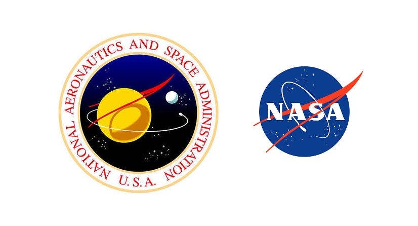
The most obvious precursor to Starfleet in our modern world is NASA, where you can a lot of the same design elements that would later show up in Starfleet designs — the field of stars, the orbital path encircling the logo, and even a sort of oblong arrowhead shape that kind of looks like the Starfleet delta got stuck in a taffy-puller (or maybe an “automatic rice picker”). Patches like these show up, framed, in the “602 Club” frequented by Jonathan Archer and others of Starfleet’s earliest officers.
AIR FORCE SPACE COMMAND
StarTrek.com
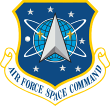
The clearest design inspiration for the new Space Force logo is the shield for the Air Force Space Command, which was designed in the early 80s. The Space Command oversaw space-based defense missions like missile warning systems, and existed right up until the the Space Force became the sixth branch of the US Armed Forces in 2019. If nothing else, this shield showcases that if the United States is taking their design inspirations from Star Trek, they’ve been doing so for decades.
THE BEGINNINGS OF STARFLEET
StarTrek.com
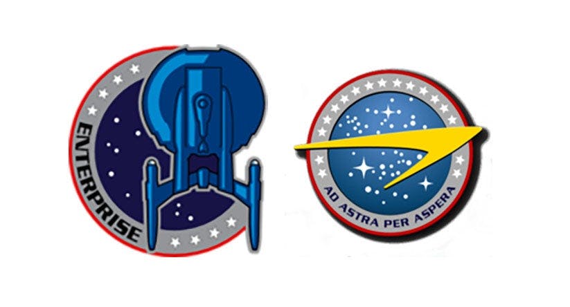
“Through hardships to the stars” proclaims the earliest example of the Starfleet logo, which is clearly intended to be a direct descendent of the NASA emblems that proceeded it. In the early days, Starfleet uniforms featured a lot of design elements later uniforms would drop: things like visible zippers, plenty of pockets, and designated ship patches for each vessel. The crews of ships like the Enterprise and Colombia proudly identified the ship to which they belonged — because when you serve aboard the Enterprise, no matter the era, you want people to know it.
INCORPORATING THE MACOs
StarTrek.com
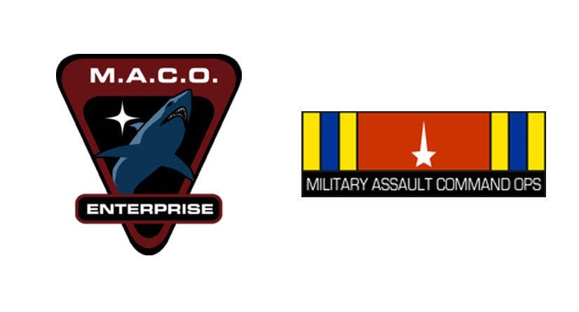
Before the creation of the Federation, the Earth stood alone. With the creation of a united Earth government, there was no longer a need to maintain militaries for individual countries to fight one another. The soldiers didn’t go away, however: they became MACOs, the “Military Assault Command Ops,” the official military tasked with defending Earth against extraterrestrial threats. By comparison, Starfleet was a smaller pilot program that spent its nascent years in danger of being scrapped.
When Earth was attacked by the Xindi, Jonathan Archer was sent to find and stop them — and he was given a detachment of MACO troops to help bolster Starfleet’s firepower. The MACO insignia includes a five-pointed star with an elongated top, which would become incorporated into the Starfleet logo
THE U.S.S. FRANKLIN
StarTrek.com
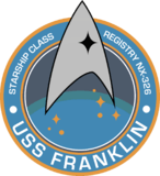
The Franklin is a ship that vanished during the early days of Starfleet, and its captain, Balthazar Edison, served as a MACO before the formation of the Federation. This mission patch shows one of the earliest instances of the Starfleet “Delta” in more or less the right shape.
THE U.S.S. DISCOVERY

StarTrek.com
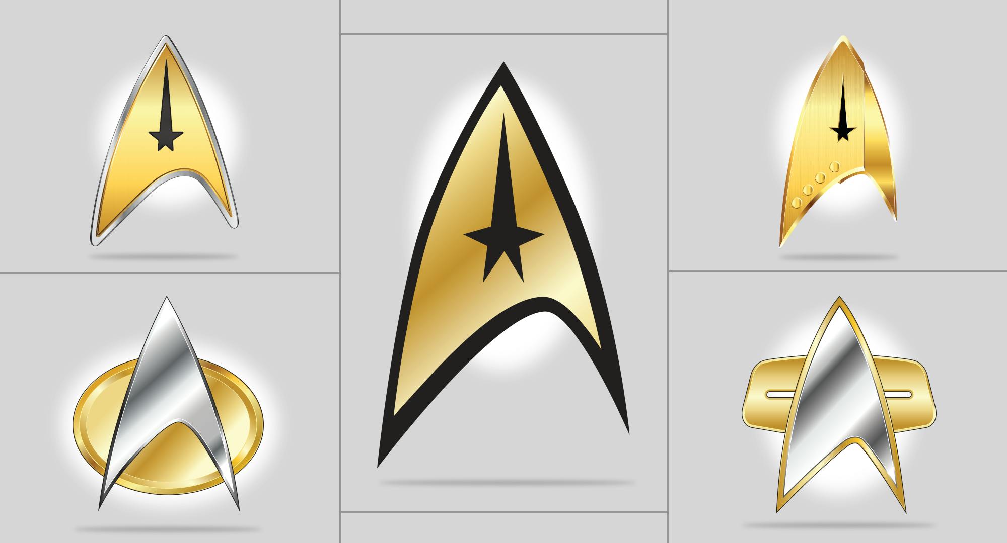
By the time of the U.S.S. Discovery, the Starfleet insignia had evolved to a very recognizable form — with the addition of a vertical line that separated the insignia into two-toned sections. The MACO star, by this point, signified command-level crew, with different-model insignia for other departments.
KIRK'S ENTERPRISE
StarTrek.com
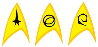
For a while during Kirk’s era, different divisions aboard the ship had different variants of the Starfleet insignia to denote the different departments, like Science and Engineering/Operations. Later generations (including The Next Generation) would indicate departments through color-coded jumpsuits.
COMBADGES
StarTrek.com
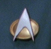
The Starfleet insignia later took on greater utility and importance as it came to house an officer’s communicator, scaled down from the bulky “flip-phone” design to a hands-free wearable device. The badge also tracks the wearer’s movements and activities everywhere they go, kind of like our smart phones do now (it’s best not to think about that too much).
THE FUTURE

StarTrek.com
Originally seen in the TNG series finale “All Good Things…” this future combadge popped up in multiple alternate futures: Captain Nog wears it in “The Visitor,” and a future version of Admiral Janeway dons one in Voyager’s finale, “Endgame.” A slightly-sleeker version of this iteration of the combadge appears to be what Starfleet is wearing by the time of the new Star Trek: Picard.
THE FUTURE'S FUTURE
StarTrek.com
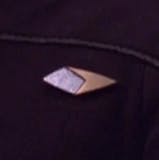
Spotted on the lapel of time-traveling 29th-century Starfleet officer Captain Braxton in Voyager, this combadge shows that the Starfleet insignia truly has some staying power.
Of course, the 29th century was previously the farthest ahead we’ve ever gotten in the Trek timeline, but with the upcoming season of Discovery we’ll hopefully see our intrepid crew carrying the gospel of slightly-oblong triangles to a new generation of future humanoids.
Sean Kelly (he/him) is a freelance writer based in St. Louis. He occasionally gets depressed that he’ll never know what raktajino tastes like.

