Published May 18, 2017
J.K. Woodward Peers Into Mirror Broken
J.K. Woodward Peers Into Mirror Broken
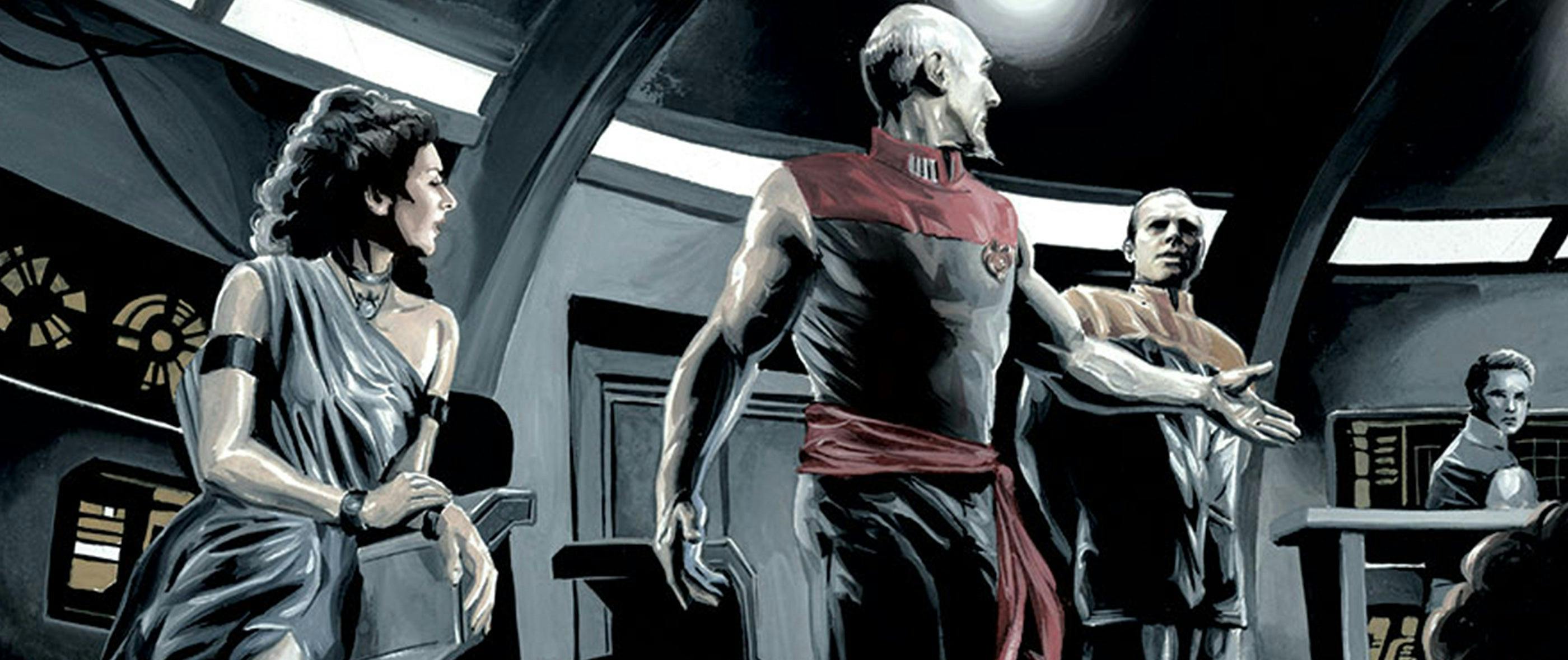
J.K. Woodward is a most-colorful guy. The prolific Star Trek artist/illustrator created one of the pieces -- "Klingons" -- for the acclaimed Star Trek. 50 Artists. 50 Years global art exhibition, as well as well as covers and/or inside art for such IDW Publishing titles as Assimilation2, the Star Trek/Doctor Who crossover miniseries, the popular adaptation of Star Trek: The City on the Edge of Forever: The Harlan Ellison Original Teleplay, and the covers of the Star Trek/Green Lantern crossover miniseries. Woodward's current project is IDW's Star Trek: The Next Generation -- Mirror Broken series, which set the artist free to reimagine the familiar TNG characters, and, man, did he have at it. StarTrek.com chatted with Woodward about his Mirror Broken work, and here's what he had to say...
How big a fan were you of the Mirror episodes of TOS, DS9 and ENT?
I was a huge fan of the Mirror Universe right from the beginning. I remember as a kid seeing “Mirror, Mirror” and just falling in love with the aesthetic. Spock with a goatee, a sleeveless captain, daggers in their flowing sashes; all of it fascinated me. When I saw DS9's “Crossover” episode I was blown away. The Mirror Universe was back. I never thought I'd see it again since TNG had chosen not to visit it. But not only was the Mirror Universe back, but it directly connected with TOS. Kirk and Spock were actually talked about on DS9.
What was your reaction when IDW broached the subject of a Mirror arc in the TNG universe?
I was thrilled but not surprised. The whole thing started with CBS. I was working with John Van Citters on the Mirror Universe product style guide. I was designing and illustrating the look of the characters and ships in TNG's Mirror Universe. As I was creating the look of the characters, I was developing back stories in my head, mostly to entertain myself, but also to help generate visual ideas. I was telling John these stories and he and I started talking about a possible comic set in this world. We agreed that the Tiptons would be perfect to write it.
Which TNG character most immediately sprang to mind as the one you couldn't wait to draw Mirror-style... and why?
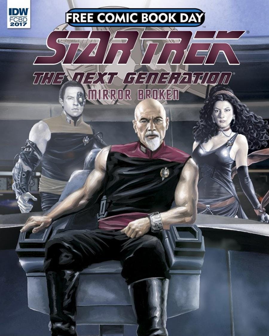
Data. I could not wait to create Data. Long before the comic and even before the product style guide for CBS, I had this idea for Mirror Data in my head. Mirror Data, like the actual Data, would be driven by the desire to be human, but how he defined humanity would be different. He would see strength as virtue above all else, because that's what the humans in this universe would have shown him. This Data would weaponize himself and he's doing it with Borg technology because if anyone could reprogram Borg nanite, it's Data. Most important, though, is that the designer in me liked the aesthetic of a "borgified" Data. It had to be done.
So, introduce readers to the world of Mirror Broken…
Mirror Broken will be a TNG story in the Mirror Universe. It will start with the Stargazer and work up to the acquisition of the Enterprise. It will tie together the continuity of the ENT, TOS and DS9 episodes. To say more than that might spoil some surprises we have in store for you.
How closely did you work with the Tiptons to realize these six installments?
I work very closely with them. We've worked together many times before and each experience is better than the last. This experience was a little different from most in that I got to show them many images to inspire the script before there was even a plot. I also sat in via skype for plotting the general outline of the five-issue arc. We also stay in contact while I work on the pages and discuss where we're going and trade ideas, so it's a very enjoyable and collaborative experience.
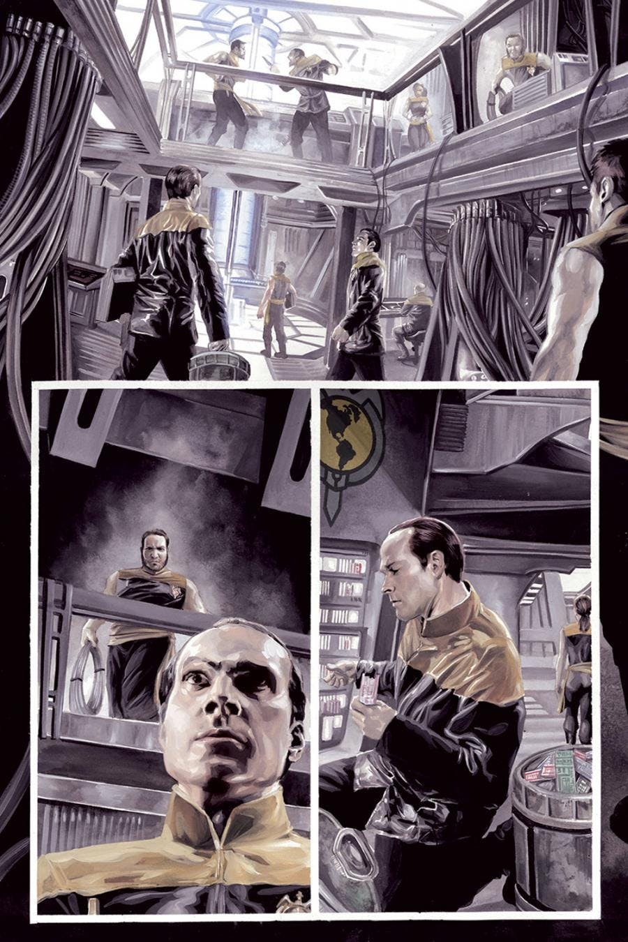
Did Data, the character you couldn't wait to draw, end up being the one you most enjoyed drawing?
It actually did, yes. Data is a favorite to illustrate even in the Prime Universe. His skin is very reflective and the highlights make it fun to paint. He's very reactive to the lighting, so there's a lot I can do with him even without the Borg parts.
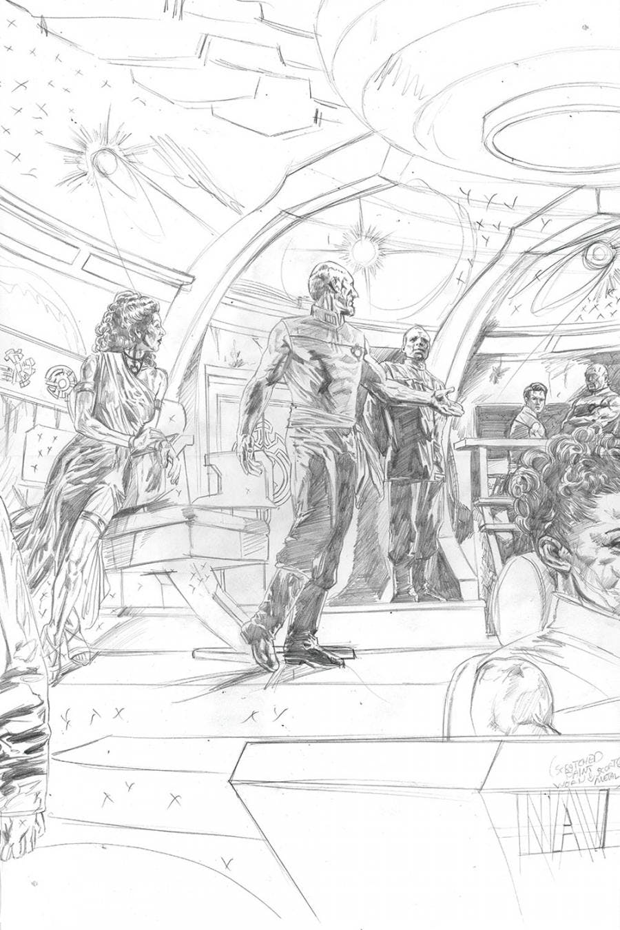
How much, if any, pulling back did you have to do? Was Picard, for example, too buff? Or maybe Troi too sexy?
Well, I always argue that Picard is not drawn too buff, he's just sleeveless. Look at Patrick Stewart in the last scene of First Contact when he's sleeveless and climbing the metal cable to escape the warp core coolant. This guy is in phenomenal shape. Now, I've never seen Jonathan Frakes sleeveless, so maybe I made him more muscular than the Prime Universe Riker, and my version of Tasha Yar is built like Rhonda Rousey, but I feel like in this universe, an ambitious officer would constantly be working on strength-building and enhancement of fighting skills.
Troi was a concern to be sure. We wanted a dangerous, femme fatale look to her, but if we take it too far it may change the perception of the character in the eyes of readers. We didn't want her to appear to be some cheesecake, eye-candy character. We wanted her to appear powerful, brilliant, treacherous and even a little terrifying. In a world of unchecked aspiration and duplicity, nothing would be more dangerous than someone who could see right through the mask and know your intent. When I put her on the cover in the initial outfit I designed, our editor Sarah Gaydos, warned me that I might not be getting the true character essence across. I solved the problem by covering the exposed midriff. It was a minor change, but it made a huge difference. While the character still appeared sexy and dangerous, she also maintained a dignity that wasn't there in the original outfit.

What media do you use to illustrate your pages? What is your process artistically?
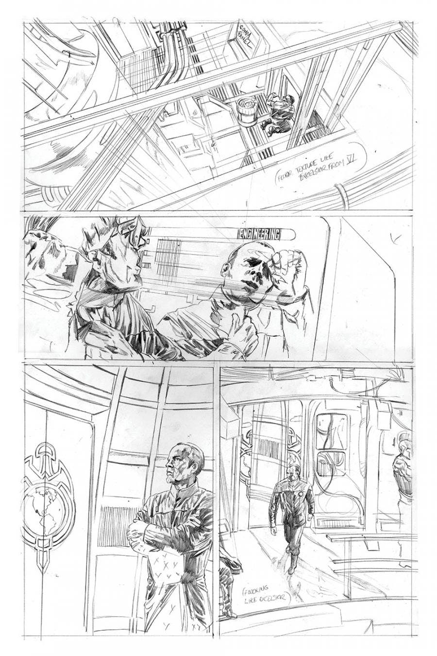
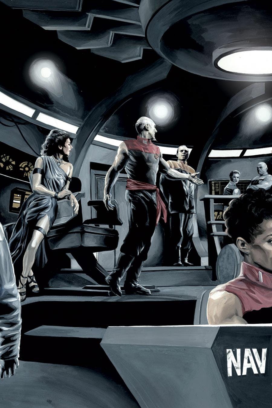
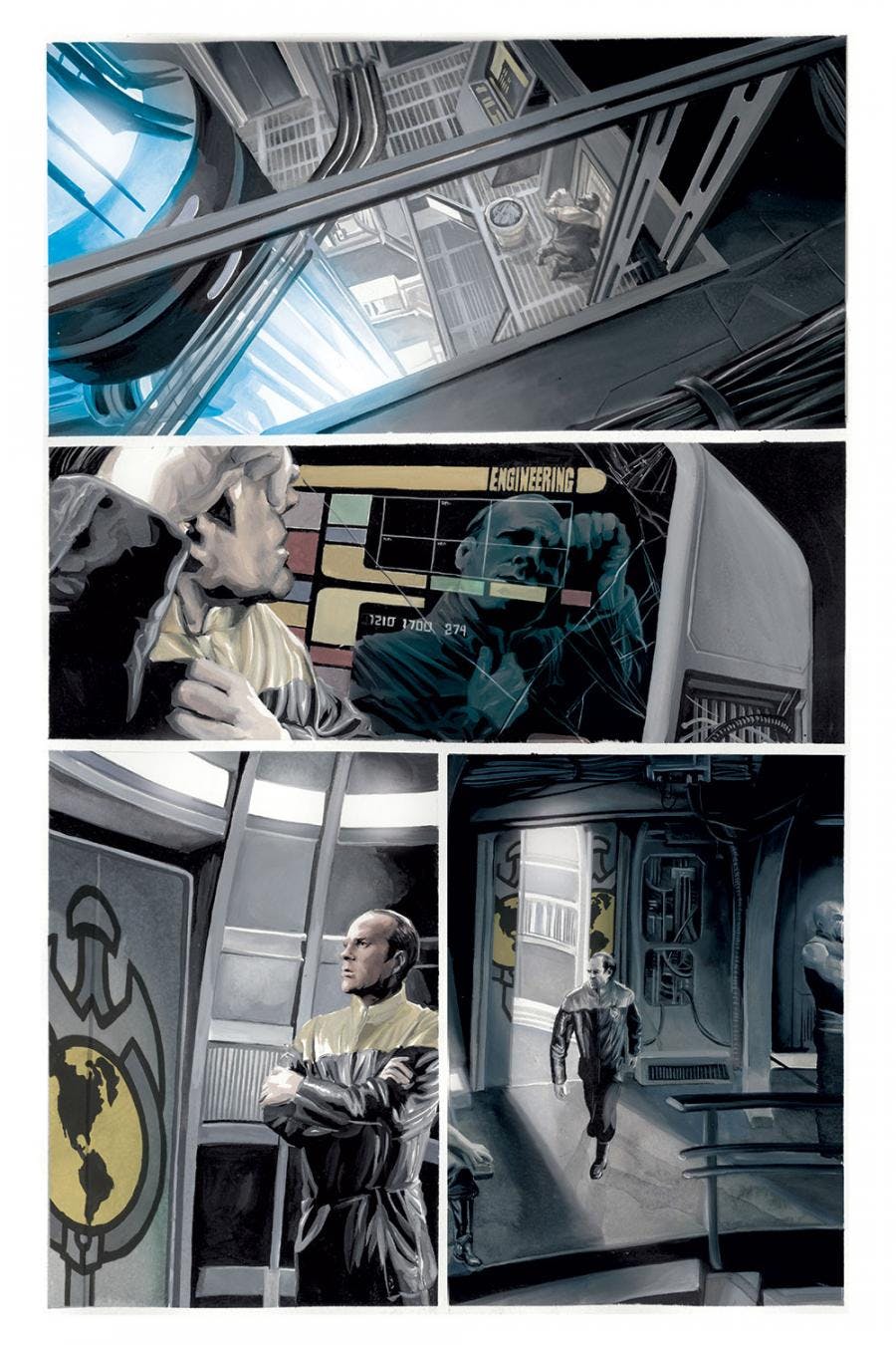
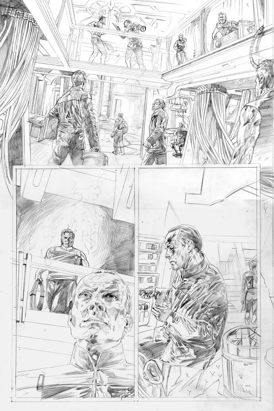
It's all hand-painted. I use gouache. I start with pencil, of course, then scan it in and upload the penciled pages to IDW. This way, they can start the process of lettering the book while I paint. Later, the painted page files can be simply drooped in to the final lettered file, replacing the pencils. When I paint the pages, I always start with the values. I drop in the darkest shadows in black, then I go through the palette from darkest to lightest.
In general, to your thinking, how complementary are words and art when it comes to comic books?
Words and art are part of the same storytelling device in comics. They are in essence inseparable and need to work together or the reader is taken out of the story. When a writer and artist do it right, reading comics can provide a more-visceral experience than any other media is able to.
Have you gotten any feedback from the actors? Marina surely has an opinion?
Well I know Marina liked a few tweets from conversations with fans about the cover of issue 0. Brent Spiner actually retweeted somebody's photo of it on Free Comic Book Day with an attached comment, "The sad truth is, that's what his arms look like. Mine, not so much." He was referring to the cover and how both he and Patrick Stewart looked.
Do you view this as a one-off project, or could more TNG Mirror Broken stories be in the offing?
In my opinion, it has to go on. I would likely go on doing this forever it I could, and I plan on pitching a new mini with the Tiptons as soon as this one is completed. There are many aspects of the universe and many more characters that can be introduced.
For additional details, contact your local comic book retailer or visit www.comicshoplocator.com to find a store near you. Keep an eye on StarTrek.com for additional details about the IDW's upcoming Star Trek adventures, as well as exclusive First Looks at covers and preview pages. And be sure to follow J.K. Woodward on Twitter.
