Published Jul 6, 2012
Guest Blog: STO -- Designing Tholian Visuals
Guest Blog: STO -- Designing Tholian Visuals

The Tholian species has only been seen in a few different episodes of Star Trek, starting with TOS and later in Enterprise. In the TOS episode “The Tholian Web” they were simply floating heads, and it was hard to tell much about them visually. In Enterprise, the CGI team fleshed them out pretty well. From that work we can tell that they have a crystalline carapace and some kind of a glowing liquid center. Having six legs and two arms gives them a mantis-like appearance, which is a nice change from the predominantly bipedal species in STO. One of the things that I find intriguing is the way Tholians move; they’ve got a strange staccato, insectoid, vaguely robotic style of movement. There’s a scene in “In a Mirror Darkly” where the crew of the ISS Enterprise are torturing a Tholian, he takes a step backwards and the way its hand and wrist move is strange and a little off-putting… but in a good way. That awkwardness inspired much of our artwork.
It’s amazing the number of people and amount of effort that go into creating the art for a species like this. There are concept artists, ship artists, character artists, FX artists and animators spending hundreds of hours to get all of the work done. When we started the concept for the basic "naked" Tholian we didn’t have to do much other than draw him in a way that would help Matt Highison, our lead character artist, with modeling him. The fun part of making the characters came in designing the EV suit. Tholians live in extremely hot climates, so they can’t survive in an atmosphere hospitable to humans. They need to wear suits where we live and vice versa. Character customization has been a hallmark of Cryptic’s games going all the way back to City of Heroes, so we tend to make all of our characters modularly. In this case we wanted to create a base EV suit that could be transformed from a simple EV suit into a full-on battle suit by adding a few new parts. Even though this is an enemy species, we didn’t want the base suit to be scary necessarily, but more believable as a suit that would be used for working or exploration. The aesthetic for Tholians is geometric and angular with lots of facets; they love triangles and tri-symmetry. We carry that motif throughout Tholian design.
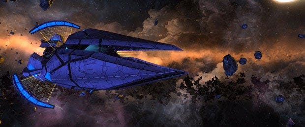
When it came time to make the ships, we started by studying little triangular craft seen in Enterprise and elaborated from there using our design rules. Adam Williams, Thomas Marrone, concept artist Chris Legaspi and I had quite a few whiteboard drawing sessions figuring out what this group of ships would look like. When you don’t have the benefit of a lot of time it’s really important to have a good team and to get them involved in the process. A good group will feed on each other’s ideas and produce a lot of them quickly. We steered away from shapes that were overly aggressive or streamlined, opting instead for an angular, faceted, slightly quirky feel. Tri-symmetry played a big part in these designs. Most of the ships have three major hull sections with the bridge pod tucked down in the center where it would be protected in a fight. After the concept process, our ship artist Ian Richards was tasked with bringing the ships to life in-game. He did it brilliantly. I think these are some of the most interesting ships and creatures in STO now. Then again, I may be biased because I had so much fun making them. So I’ll let you decide; tell us what you think. Either way, Tholians will add some diversity to STO and provide a fresh new group for you to deal with.
We can’t wait for you to check out the Tholians in-game when they are introduced with the launch of Season 6: Under Siege.
Jeremy Mattson
Lead Artist

