
Inspiration
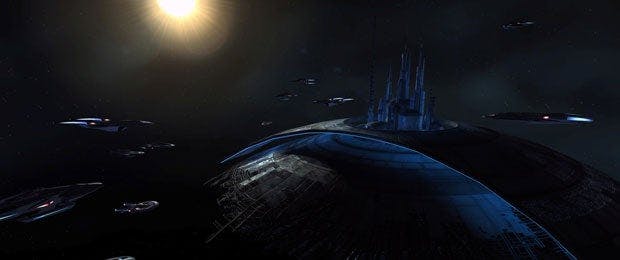
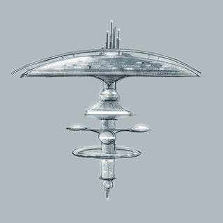
The first thing that comes to mind when I think of a Federation-built starbase is Earth Spacedock. I've always admired that station and I really like our version in STO. So I immediately thought that I wanted to follow that design motif: big mushroom shape, saucer on top.
But I wanted to do my homework to be sure I was making the right decision. I talked with the team; we did some brainstorming and took a look at different space stations, starbases, spacedocks, research facilities etc. Many of the Federation space stations use the mushroom/saucer design or a variation of it. ESD, Jupiter station, 375, Regula I (and its many variations) and K7 just to name a few.
One of the benefits of working on a Star Trek game is that the IP has such a rich visual history to draw from. As I was doing research and sketching I started wondering about the process. How many other artists had been given a similar task over the past 45 years? Did so many of stations follow a similar design theme because each successive designer riffed on the previous ones work?
I did more research, and I'll speculate that this design must go all the way back to TOS art director Matt Jefferies and crew, and their K7 station, and in turn Douglass Aircraft, who built the original model that was later modified and used in TOS in 1967. So it all started back in the mid-1960s with somebody at Douglass Aircraft creating a model for an actual space station. That person created something that would inadvertently influence the look and feel of one of the most iconic science fiction series ever created. And now here I am today, over 45 years later continuing that tradition. Far out, man.
The 2409 Design
Whenever we're doing something original in STO we always look at what has been done before and at the very least give a nod to the IP or intellectual property. There's a running joke on the STO art team about the IP-ness and how big any given art asset's IP-ness is. (I know, I know, we've got a lot of growing up to do).
I decided to run with the mushroom motif because it's immediately recognizable as Starfleet. Now, I have to figure out what that style of station will look like today. In this case we're taking an existing design and thinking about how it would evolve over 120 years or so. The 2409 STO aesthetic for Starfleet is sleek and elegant with clean lines and long curves. The best example of this is in the final design of the Odyssey Class Enterprise F.
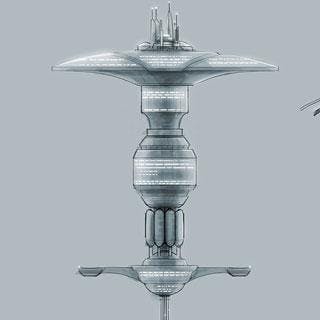
After doodling in my sketchbook a while, I sat down at the computer and did the first actual sketch. That first design was close, but it felt too rigid: too many long flat plat planes and a little too angular. I was going for kind of a schematic style in the drawing and it was influencing the design too much. So I decided to take a different approach and draw loosely with lots of curved lines and a wide, low profile saucer.
Pretty soon I had something I liked and was ready to move on to mocking it up in 3D. Stations like this are made of fairly simple shapes and, since I wasn't filling in the details, the model came together pretty quickly. That left me some time for the next step: Figuring out the Tiers.
Tiers

The first tier is a tiny little base, but it's your tiny little base. Over time, the Fleet upgrades the base and it grows and grows until finally at tier five it is big and majestic. Not too big and majestic though; we didn't want player fleets to actually outdo Starfleet.

Hustle and Bustle

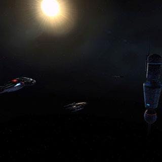
Denis Osmanbogovic and Jeff Miller have both done a great job building the different tiers of support structures that surround the base. We've paid a lot of attention to detail, adding little touches like animated solar panels, shipping containers and blinking lights. Then, of course, there's the player traffic...
Real Experiences
Which leads me to another thought: As I was doing research for Season 6 and thinking about the other artists and designers and model makers who have contributed to Star Trek over the years -- those people who have created art for the various movies and TV shows, artwork all designed for a fictional universe -- I was reminded of what I feel is the most rewarding aspect of making games.
It's that the work we do is meant to be experienced firsthand by people. We're making a new place where multitudes of real people are going to be playing, socializing and making friends... a place people are actually going to work together to build and fight alongside each other to defend. This isn't a fictional place that's only seen on screen, it's a virtual space station that people will experience firsthand.
It makes me happy to think about that.
Jeremy MattsonLead artistStar Trek Online
