Published Nov 8, 2013
Guest Blog: Federation Interiors Redesign
Guest Blog: Federation Interiors Redesign

Hi Captains --
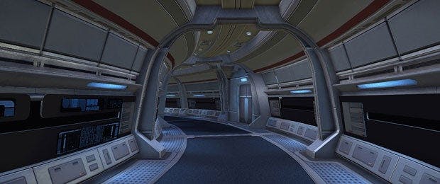
Jeff “LCDRMiller” Miller here to talk about the new Federation ship interior featured in the upcoming, revamped Federation tutorial. I won’t lie; I had wanted to do a revamp of the Federation hallways almost since I started on the Star Trek Online team. So when I was asked if I wanted to tackle this project I was really excited. Finally, a chance to create an interior that is dynamic and, of course, has curved halls.
Interior Halls
Let’s talk about the interior hallways first. We wanted to be sure to tackle the things our community has been asking for, for a while now. We took time to sift through our forums and pick out the ideas and hopes that you all want to see in a new Federation interior. The ideas and suggestions we came across all seemed to point toward two things: 1) Dynamic hallways, and 2) A smaller, more compact feel. I am pleased to tell you all that the new design caters to both of these aspects, while not losing the required specs for combat gameplay. And yes, the elusive curved hallways made it in too.

As you may notice, the halls are dynamic and were built in sections that can easily be swapped out with other things. For example, if a mission calls for the player to be in a more engineering type deck, we can very easily swap out a paneled wall section with piping. Another example would be what we like to call “special situations.” A special situation would be if a mission required a sudden explosion to occur and an entire section gets blasted out into space. The way the new hall kits are made let us do cool new things like this a lot more easily.
Hallway Design
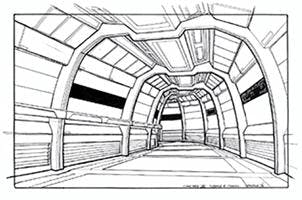
When it came down to the question of look and feel, we had a pretty clear vision on what we wanted. We knew that we didn’t want it to match the 2409 design of the Odyssey Bridge, but needed it to feel like this new design was the basis of what the 2409 would eventually become. So our first stop was to study all the design cues that made the 2409 interiors 2409. Sleek, curvy and clean are the main elements pulled from the 2409 design. We also wanted to pull in design elements from LCARS into the architecture itself. We also took the time to study some of the design sketches (as exampled above) on how the original Sovereign hallways were built for the television show.
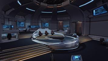
Origin BridgeThe new Federation Bridge, Origin, was really awesome to create. It needed to fit with the same style and follow the same design elements as the new hallways. It also needed to be the stepping stone bridge that would eventually lead to the Odyssey 2409 bridge. We pulled the sleek and curved structure design from the 2409 style into the new bridge, but also keeping in mind to keep an older era feel as well. We pulled many things design-wise from older generations of bridges. Looking at how the seating was arranged, stations were designed and the final touches were added, including a bit of asymmetry. Overall, we feel that the design of the new Origin Bridge hits all the points we set out to hit. We really believe you all will love the new design.

It has been a blast creating these new interiors. The amount of flexibility the new halls bring to the table opens up many possible doors for future gameplay and experiences. We cannot wait for you all to see it shine in the new Federation tutorial launching with Season 8.!
We are also excited to announce that the Origins Bridge will be the new default bridge for all Federation ships. So close the shuttle bay doors, and punch it to warp 9 in style.
Live long and prosper,
Jeff "LCDRMiller" Miller
Environment Artist
