Published Jan 22, 2021
Designing the La Sirena
Eaglemoss goes behind the scenes of the creation of Rios's ship.

StarTrek.com
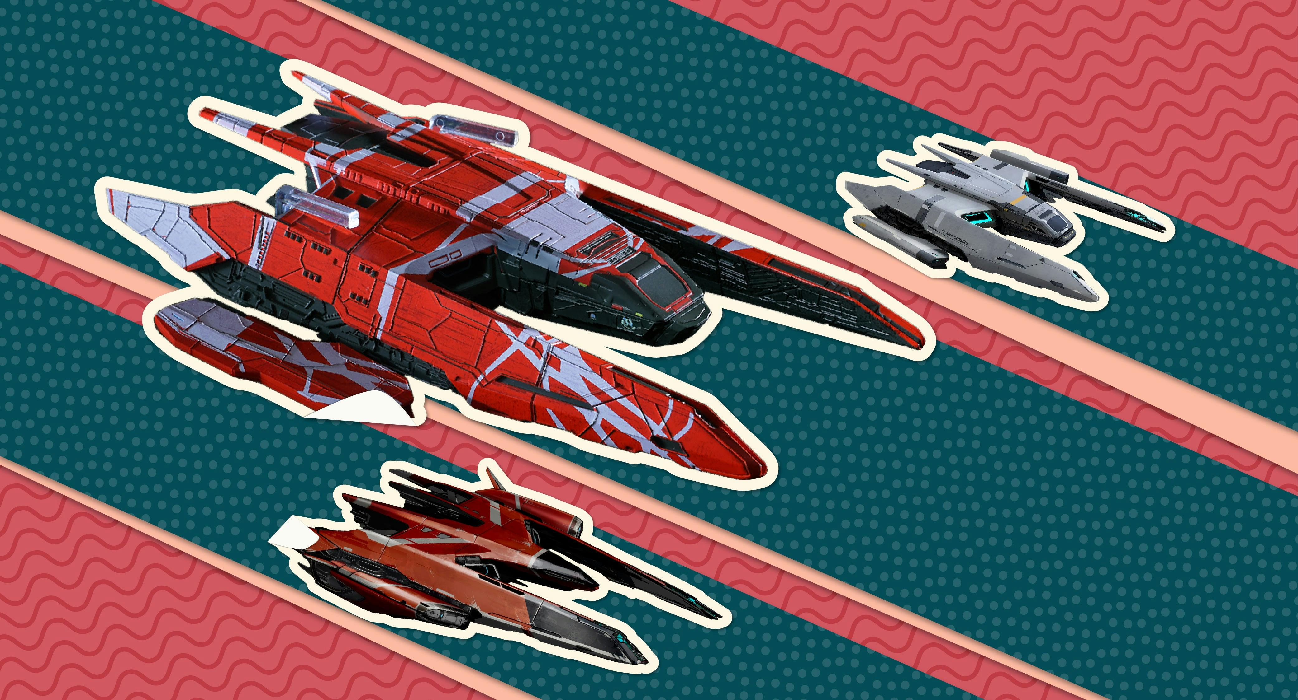
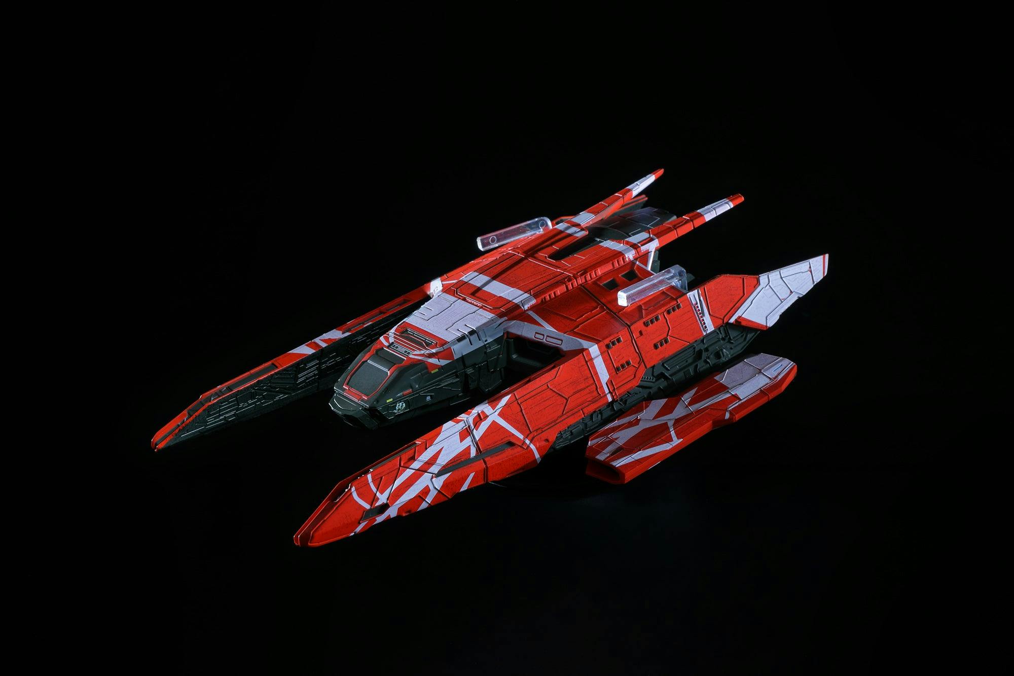
This April Hero Collector launches the first in their series of die-cast ships based on Star Trek: Picard. As you’d expect, the series starts off with the series’ main ship, La Sirena. To find out more about the model and to reserve your copy visit www.herocollector.com/sirena.
Each model comes with a magazine that among other things, explores the design history of the ship. StarTrek.com has an exclusive extract that reveals the story behind the ship.
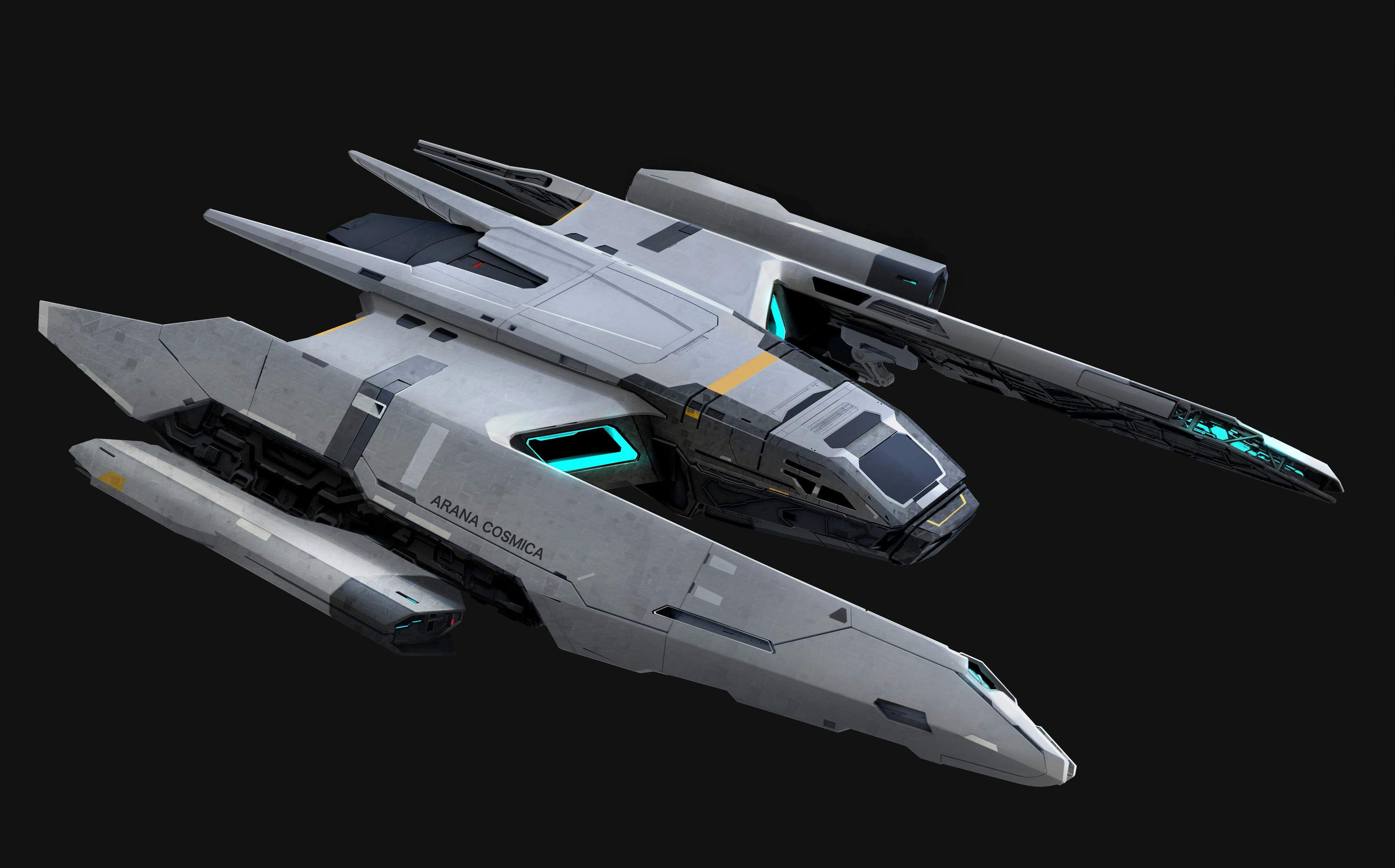
Rios’s ship was designed by Mark Yang, a newcomer to Star Trek who was brought in by production designer Todd Cherniawsky. As Yang remembers, the ship Cherniawsky described to him was called the ‘Arana Cosmica’ or Cosmic Spider. “Todd wanted it to be a lot smaller,” he says. “They wanted it to be kind of a Swiss army knife – to be able to do a lot of different things. The idea was that this was probably not a military ship, or even a high-powered ship, to begin with, but then it was modified extensively. Someone had been using it to do things it wasn’t originally meant to do, so every few years it would get enhanced equipment.”
The first sketches Yang produced looked like traditional Starfleet vessels, but he only felt he had something when he hit on a design that was more like an enhanced runabout. “The thing that really struck me,” he says, “was that this ship was smaller than the Defiant. If you think about the runabouts and the Delta Flyer, you can see they didn’t go with the saucer shape for the smaller ships. Even though this was a bigger ship – more of a bomber size – I thought it would be more like that.”

StarTrek.com
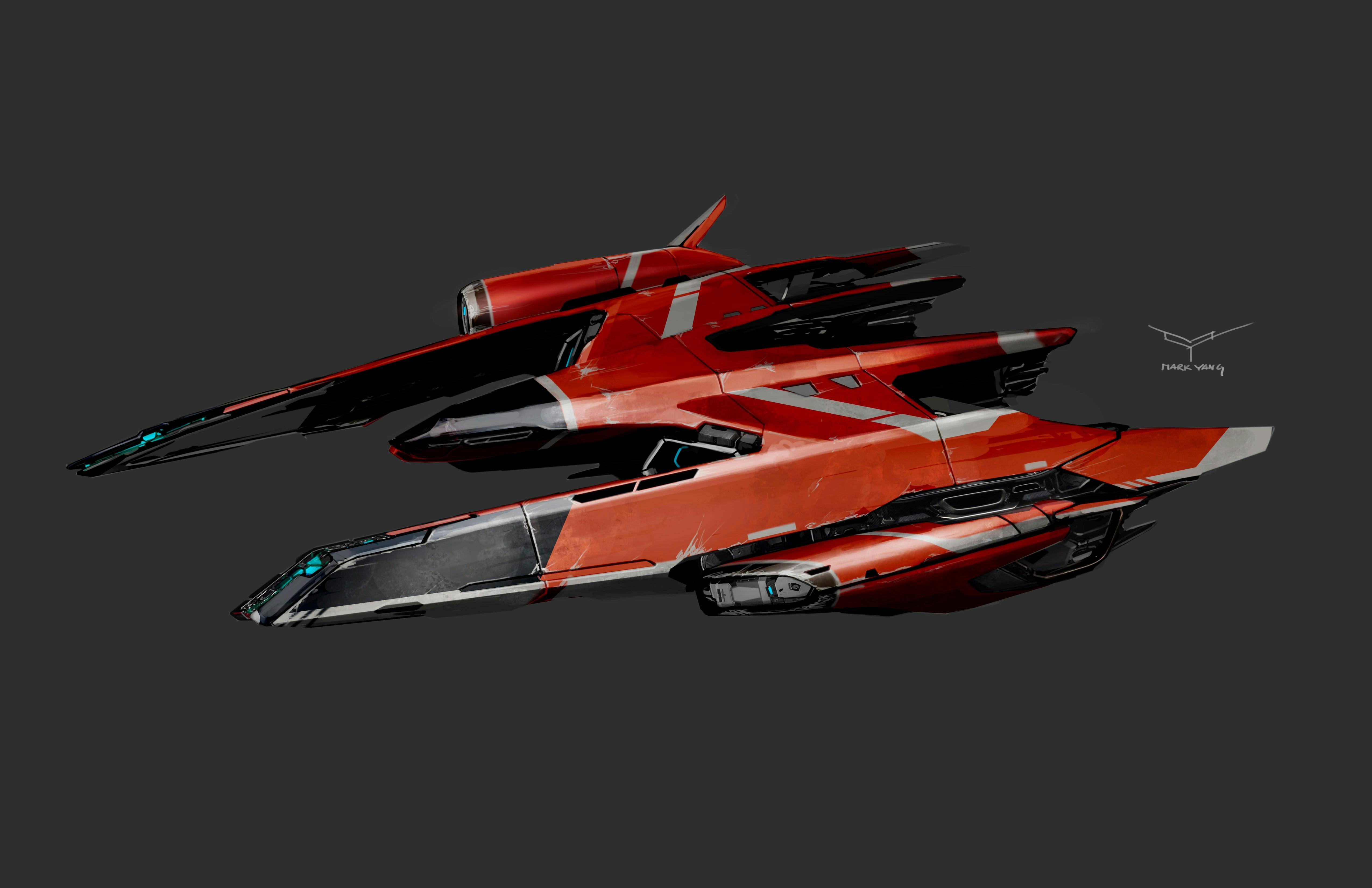
Yang produced another sketch that he presented to Cherniawsky. As Yang goes on to explain, he built the design around the warp nacelles. “I figured for a small ship to be credible, then the warp nacelles were probably going to be the biggest part of it.” The central body of the ship had a shape that was reminiscent of a twenty-first century aircraft and forms an arrow shape. The design of the rear of the ship was dictated by the early script outlines. “I think the biggest departure is probably the tail section and that was a functional decision. At the back there was some kind of industrial component that could be latched on to a cargo module or where additional equipment could be plugged into the ship. Think of it like a truck that hooks on to cargo or another vessel.”
The need for Rios’s ship to tow cargo presented Yang with a problem, which rapidly became an opportunity. “The typical impulse engine is in the back, but that would be blocked by the cargo so you needed some kind of propulsion on the sides. That’s where the pods on the sides came from. I always thought they weren’t part of the original design but were attached afterward.” This just left the cockpit, which Yang provisionally placed at the front of the nose section.
Cherniawsky gave Yang the go ahead to take the design further. “The next drawing,” Yang remembers, “was a more refined version of the napkin sketch. This was the first time I did anything that was shown to the producers. I think Patrick got a look at it and we got a positive response, so I kept on going.”

StarTrek.com
This drawing was shared with the rest of the art department who started asking about how the interiors would work. “I worked with a couple of people designing different parts of the set, mainly Rob Johnson who did most of the interiors, and Forest Fischer, who did a lot of the components. The idea is that a lot of the internals would be arranged like a submarine, in a straight hall.”
While work started on the interiors, Cherniawsky asked Yang to produce some visuals that illustrated what the ship would look like in action. “Todd told me that they wanted to do a spaceport shot. We were hoping that we’d have a shot where Picard walked up to a ship after all these years of not space-faring and saw that this is a new thing. It’s something that should be familiar but it’s still new.”
Next Yang spun the angles round to work out the rear of the ship in detail. “They wanted cargo access from the back,” Yang nods, “which would take up a lot of the ship since it’s so small.”
Around the same time, Yang started to think about where he could put the ship’s weapons. “Originally, it wouldn’t have had more than a couple of phasers to cut things, but then they put big impulse engines in there. The front section of those was actually a weapons bay where they put in more powerful phasers and torpedoes.”

StarTrek.com
When this was done, he produced a series of drawings showing alternative color schemes for Cherniawsky and the producers to choose from. “For some reason, red just jumped out at him, so we gave it a very striking paint job.”
At this point, Yang left the Picard art department to work on another project. Cherniawsky kept in touch with him showing him the progress of his design, which was evolving as the story changed. In particular, the bridge got wider and this meant that the central section of the ship was revised to accommodate it. The work was done by the VFX team who were building the model, but Yang returned to help finalize it.
The art department would have one last addition to the design. It was decided that Rios’s ship, now renamed La Sirena, would have nose art. John Eaves rapidly produced artwork showing a mermaid that was added to the digital model. La Sirena was finally ready for action.


