Published Aug 2, 2012
FIRST LOOK: New Retro Art Prints
FIRST LOOK: New Retro Art Prints

Star Trek fans are in for a 20-month-long Trek treat – and it starts today. Artist Juan Ortiz has created 80 movie-style posters, one for each and every episode (including the first pilot) of Star Trek: The Original Series. The images feature retro-style art that recalls 1960’s-era posters, pulp novel covers, comic books and advertisements, and will be introduced at a rate of four a month, on the first of each month, over the next 20 months – and not in chronological order.
Quantum Mechanix (QMx) will launch the program in the U.S. and Canada while Pyramid will offer the prints in the UK. Additional countries will be announced shortly.
Beginning this month, QMx will offer the four prints as a set of plated-printed lithographs on 100-pound, aqueous-coated, satin-finish paper. Each print measures 18x24 inches and the set of four is $34.95. US and Canada fans can purchase the sets at QMxOnline.com, StarTrek.com, ThinkGeek.com, AllPosters.com, PosterRevolution.com, EntertainmentEarth.com, RedfordFilms.com, AnimeWild.com, RockinRobot.com and other retailers.
Pyramid will have the images available on Wood for £39.99 (43x59cm) and £49.99 (45x76cm), Canvas for £59.99 (60x80cm) and as Framed Art Prints at £49.99 (60x80cm) in September. In addition, they will offer 1701 limited edition box sets of twelve 30x40cm art prints on 250gsm art stock paper for £120 beginning at the Destination Star Trek London event in October. UK fans will be able to purchase the items at Amazon.co.uk, ForbiddenPlanet.co.uk and Oneposter.co.uk.
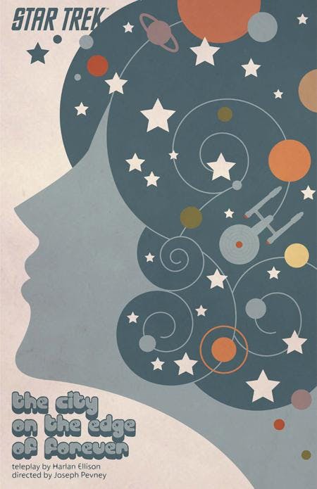
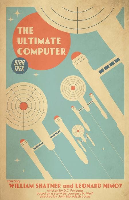
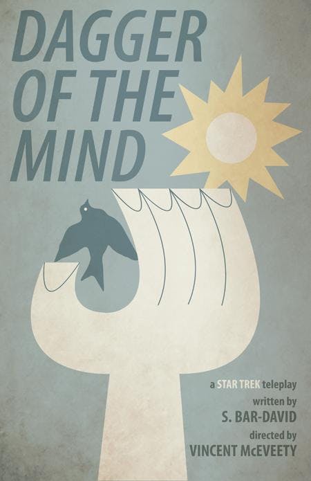
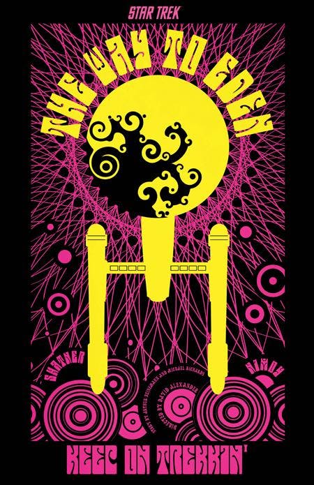
This month’s posters include “The City on the Edge of Forever,” “The Ultimate Computer,” “Dagger of the Mind” and “The Way to Eden.”
Ortiz is an avid Star Trek fan, of course, has been an illustrator/designer for Disney and Warner Bros. since 1985, and has penciled covers for Looney Tunes and Tiny Toons magazines. Further, he is the publisher of his own comic book series, Silver Comics, recently worked for Cartoon Network, developing art for their marketing needs on such shows as Ben 10 and Generator Rex, and publishes The Skull Army, a macabre/detective pulp featuring his creation (named) The End. StarTrek.com recently spoke with Ortiz, eliciting the story behind the TOS posters and learning more about his career. Every four weeks, StarTrek.com will check in with Ortiz in order to preview that month’s TOS posters.
What inspired you to create movie-style posters for TOS episodes?
Ortiz: It started with just three posters. I was just doing these for myself, not really thinking about making any money off of them. I liked how they looked and had fun creating them, so I figured why not do more? Even though I had majored in editorial illustration in college, I never really got to work in that field and these posters sort of filled that gap for me creatively.
You started this project on spec, doing several posters on your own and presenting them to CBS. Take us through that process. And how shocked/pleased were you when CBS said, "This is a go, now come back to us with posters for every TOS episode"?
Ortiz: After I made about 30-40 of them, I showed them to a few professional artist friends of mine and they all insisted that I should have them printed. I had worked as a product designer for Disney and Warner Bros., so my first instinct was to acquire the license and maybe print out a set of postcards or something. I contacted CBS and fortunately for me, the response for the posters was a good one. We decided, however, that having some of the CBS partners create the products would be a better way to go. Up until now, though, I had a tough time believing that it was all really happening. Hopefully the fans will appreciate the effort I made.
Our understanding is that you created all 80 in about two weeks. First, is that accurate? And, if so, how the hell did you do it all so fast and at such a high level of quality?
Ortiz: Nah, I'm not that fast. All 80 took about two and a half months with a month in between for my freelance work. I had no deal with CBS yet, so I had to pay the bills before continuing on with the posters. They averaged about one per day, but they got tougher towards the end. Fifty percent is layout, the other fifty is execution. For me, anyway. I also had a month with which to make some revisions and legal changes, dealing with actor likenesses that CBS did not have the rights to. I kept myself focused by playing Star Trek: The Motion Picture on my computer over and over again.
Before we talk about the first four TOS posters that will be released, give us your background. Where are you from? Tell us more about your time at Warner Bros. and Disney. How would you describe your style of art?
Ortiz: I was born in Puerto Rico before moving to New York City, where I attended Art and Design H.S. and the School of Visual Arts. My first job out of college was for Disney Consumer Products as a character artist. From there I went to the Warner Bros. Studio Store., both in New York at the time. I moved to California in '96, where I continued to work for the WB Store and the Disney Store. By this time I had started doing more design work. My approach to art is simple when working on posters. I'm not a big fan of minimalist posters, but I don't like including the kitchen sink, either. On these Star Trek posters, I tried to be conscious of what other designers were doing and trying not to draw comparisons with their work. I've been influenced by many artists, designers and even movies. So I have an eclectic taste.
How big a fan are you of Star Trek: The Original Series?
Ortiz: Even though I have seen every episode of TOS, if it's on while I'm channel surfing, I'll have to stop and watch it. It's nostalgia for me. I'll never get tired of watching them.
We'll be catching up with you once a month to preview each set of four posters that will be released. Let's start with the posters coming out today. Take us through what inspired each one, and then we've got a few poster-specific questions... "The City on the Edge of Forever" -- How long did it take you to nail Joan Collins' profile?
Ortiz: I'm not sure that I nailed her likeness, really. I was more concerned with what was supposed to be happening in Edith Keeler's head. I went with a 70's/”Lucy in the Sky with Diamonds” approach with this one. The Beatles' Yellow Submarine was and still is a big influence in much of my work.
"The Ultimate Computer" -- Why did you add in so many episode credits, and how do those complement the art you've done?
Ortiz: Not all the posters have all of the actors’ names on them, but I knew that they would all need to have the writers and directors names on them. They are, after all, the creators. I'm just interpreting their words and visuals in a different format.
"Dagger of the Mind" -- That's very stark, with few colors. Interesting choices. What went into that one?
Ortiz: The image, of course, is a stylized version of the patch worn by the doctor in the episode. The idea behind the poster came from the early days of TV. Dramas were performed live, so they were actually plays being filmed. I tried to give this poster an old Playbill look.
"The Way to Eden" -- That one feels very Grateful Dead-esque and like something you'd buy at Spencer Gifts and put under a black light at home. Would you agree?
Ortiz: Yeah, absolutely. As a kid, I used to be obsessed with black-light posters by The Third Eye company during 1970's. I knew that I wanted to create a black-light poster for this series and naturally “The Way to Eden,” with its hippie theme, seemed perfect. Depending on the ink used to print this one, I'm not sure that it will work, but I can't wait to try it out.
Watch StarTrek.com for ordering information. The next four images will be revealed on September 1st.

