Published Mar 3, 2014
FIRST LOOK: Final Quartet of TOS Art Prints
FIRST LOOK: Final Quartet of TOS Art Prints

The Star Trek: The Original Series Art Print Program kicked off in August, 2012, with each month heralding the arrival of a new quartet of retro-style posters created by artist Juan Ortiz and based on the 79 Original Series episodes and the first pilot, "The Cage." Well, it's now been 20 months and Ortiz's final set of prints -- depicting "Shore Leave," "Where No Man Has Gone Before," "Metamorphosis" and "Turnabout Intruder" -- is available now. StarTrek.com caught up with Ortiz, who commented on the whole TOS Art Print experience and previewed this month's prints.
Here's what he had to say:
How amazed are you that with this batch of March TOS Art Prints, all 80 of them will have been released? It's been 20 months, nearly two years. And how have you enjoyed the ride, with the exhibition, the book, the wine, shot glasses... etc.,?
ORTIZ: Like most rides, it has its ups and downs. I'm not really into interviews on camera nor over the phone, but I understand the importance of promotion. The exhibition was fun and there might be one set up at this year's Las Vegas Star Trek convention. There's also The Animated Series prints left to be released, so the ride will go on a few more month.
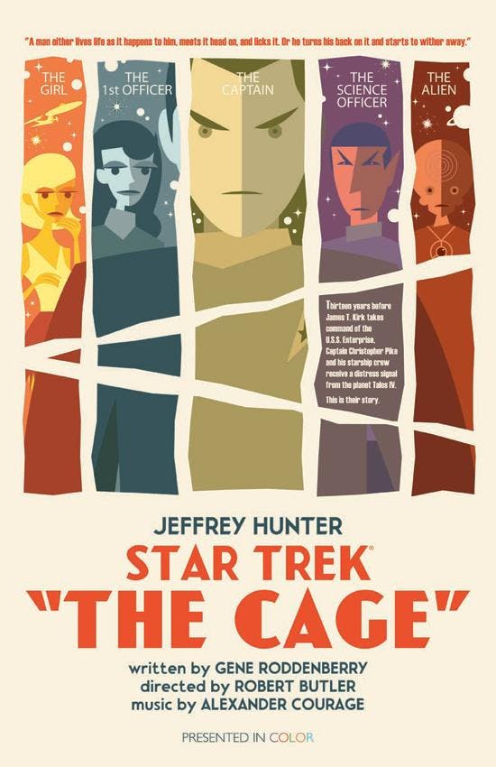
Which print from February elicited the strongest response -- and what was your sense as to why it did so?
ORTIZ: I would have to say it was "The Cage," for the same reasons why I like it. Simple, but with a lot going on.
Let's start with "Shore Leave" from this month's quartet. What inspired this one? And you just couldn't resist including a rabbit, eh?
ORTIZ: It began with the rabbit. I tried several different illustration styles, but couldn't quite get the right level of seriousness. The collage direction was the way to go, for me. The grays and muted colors give it a more mature look, away from the obvious guy-in-a-rabbit-suit aspect of the episode.
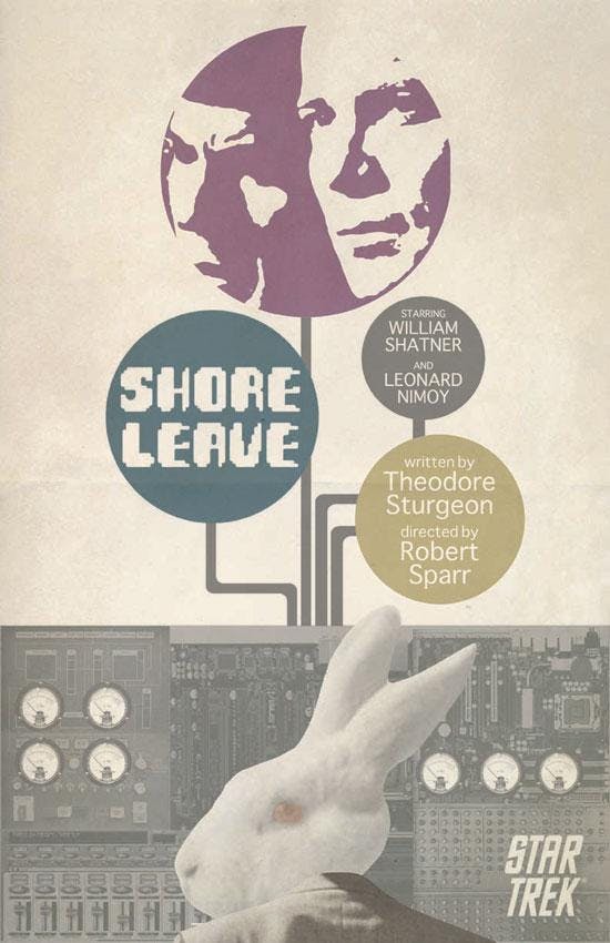
Our understanding is that this is your favorite of all 80 of the prints. If that's accurate, what is it about this one that you like most/are proudest of?
ORTIZ: I seem to have a different favorite depending on my mood, but this one keeps popping up. I like when an idea comes together with ease, like this one did. It's simple, but works without being too illustrative or too colorful. It's the right balance of seriousness that I was trying to achieve, especially when your main image is a rabbit in a suit. I wanted it to be more thought-provoking. If you're a Star Trek fan, you'll get it. If you're not a Star Trek fan, you will hopefully want to watch the episode.
Up next is "Where No Man Has Gone Before." How did you go about creating that very cool, 3D-ish effect for it?
ORTIZ: The image was created in Adobe Illustrator. A lot of it is by trying and failing until I get it right. I may have spent more time figuring out the color before finally settling in on the blue.
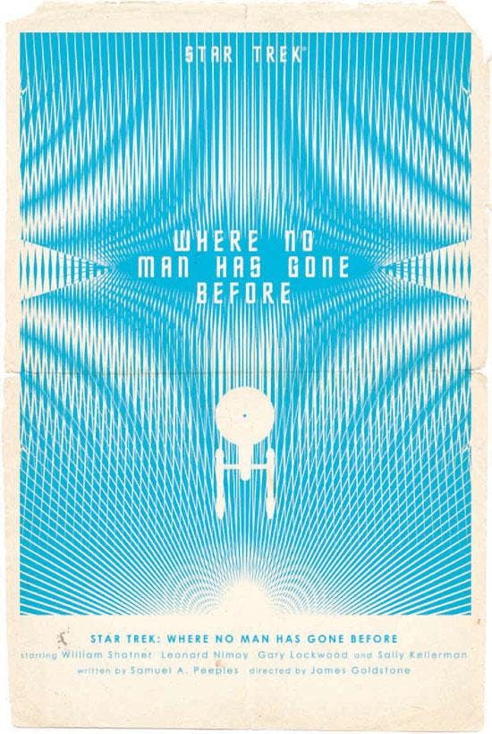
How much of an inspiration was The Motion Picture on this particular piece?
ORTIZ: That thought did enter my head at first. And for a while I considered going in that direction, but it worked better for "Where No Man Has Gone Before."
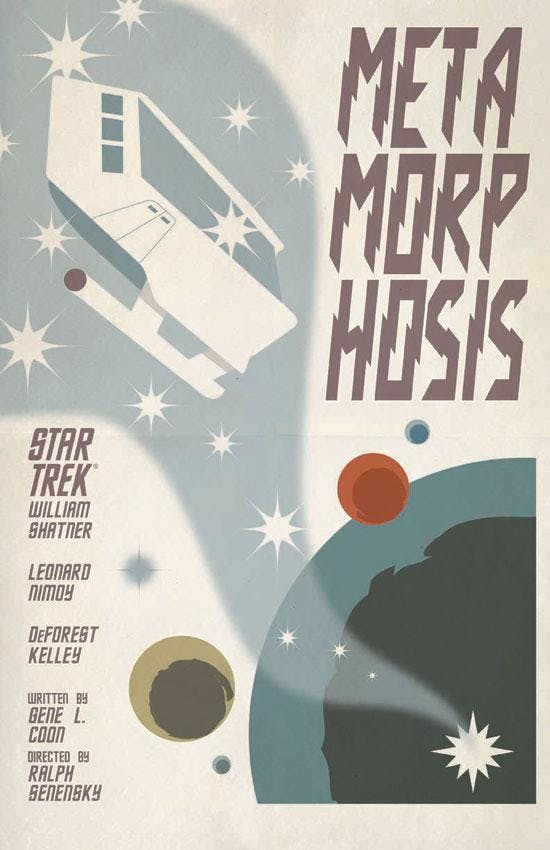
What were you aiming for with "Metamorphosis?"
ORTIZ: I wasn't trying for anything fancy on this one. I felt like I had a pretty good layout, so I kept it as is.
Lastly, there's "Turnabout Intruder." It's got much more copy than usual, or if not more copy, than at least it's bolder and fills more of the page. Take us through your decision to go that route.
ORTIZ: I had been inspired by Japanese posters. That's why the copy is so bold. It morphed into more of a magazine cover, instead. But that's okay. Where I start is not as important as where I end. I did spend a lot of time at the magazine section of the Japanese bookstore. So that may account for the course change.
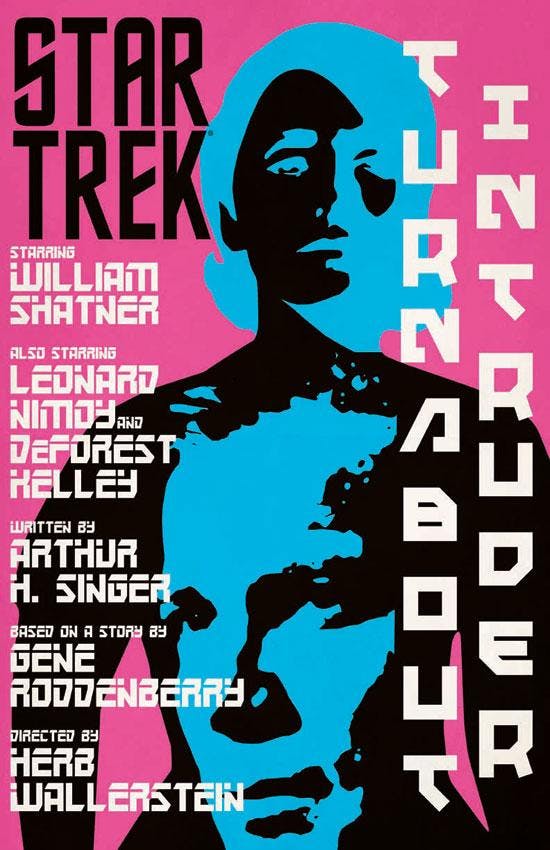
How about the color choices, particularly the pink and blue?
ORTIZ: Despite the obvious, I did not pick the pink and blue because of the male/female switch in the episode. I wanted something bold and the blue and black both really popped against the pink. I was worried that this one may not sit well with the rest of the group, but it makes a good segue into the more brighter Animated Series prints that I created the next year.
Which one of these four would you put on the wall in your own home and why?? (we're assuming "Shore Leave" if that's really your favorite of all 80).
ORTIZ: I would pick "Shore Leave." But I would pick a wall that doesn't need all that much color. Like an exposed brick wall, maybe.
___________________________
The StarTrek.com Shop is offering the four prints as a set of plated-printed lithographs on 100-pound, aqueous-coated, satin-finish paper. Each print measures 18x24 inches and the set of four is $34.95. Fans in the U.S. and Canada can purchase the sets below.

Pyramid will have the images available in the UK on Wood for £39.99 (43x59cm) and £49.99 (45x76cm), Canvas for £59.99 (60x80cm) and as Framed Art Prints at £49.99 (60x80cm). UK fans will be able to purchase the items at Amazon.co.uk, ForbiddenPlanet.co.uk and Oneposter.co.uk.


