Published Nov 26, 2013
Can You Guess What Map This Is?
Can You Guess What Map This Is?

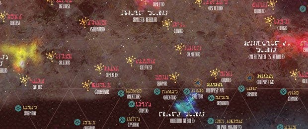
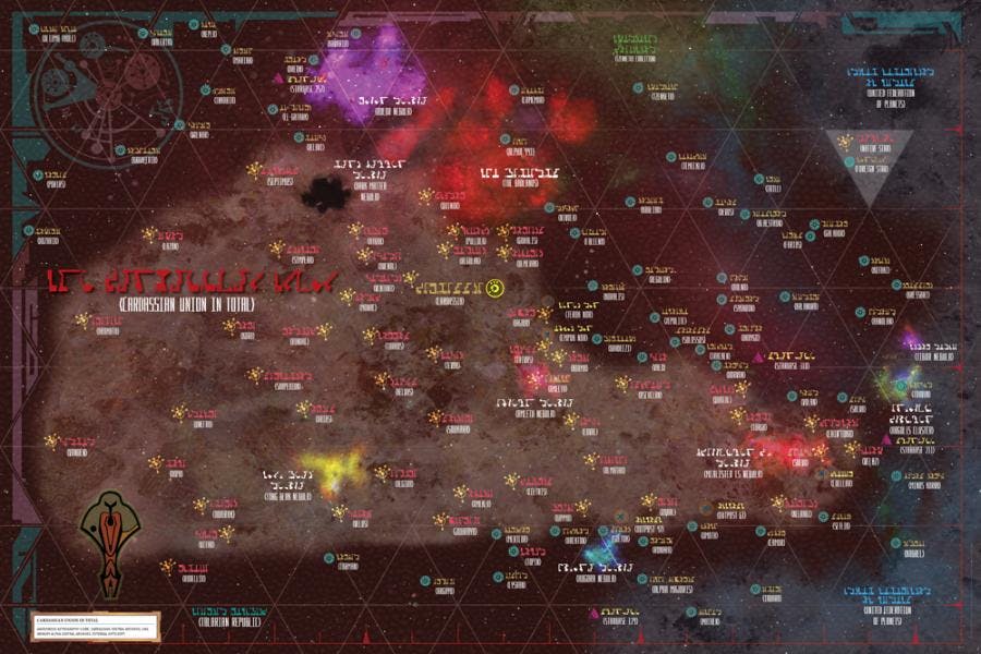
Can you guess what map this is…?

It’s a Cardassian Union map, dating back from the era of Bajor’s occupation, and it’s just one of the 10 original, fully removable large-format maps of the Star Trek universe that will be included in STAR TREK Stellar Cartography: Starfleet Reference Library. The upcoming book, due out in December from 47North and becker&mayer!, also features an ancient Vulcan map, a Romulan government map of the Empire and a Klingon map (in Klingon and pre-Organian Peace Treaty), which combine to offer a rare glimpse into and beyond the expanse of Federation space through the multiple lenses of the galaxy’s key players.
STAR TREK Stellar Cartography: Starfleet Reference Library will come housed in a handsome clamshell case and paired with a fully illustrated book with detailed information about systems, planets, topography and more. Star Trek expert and regular StarTrek.com guest blogger Larry Nemecek has written the 48-page collection, which features illustrations by Ian Fullwood, Ali Ries and Geoffrey Mandel.
To learn more about the evolution and challenges of creating Stellar Cartography, StarTrek.com reached out to Ian Fullwood in his native England. The veteran illustrator, via email, took the time to answer our questions extensively. Here's what he had to say.
How deep is your love for Star Trek? How did you come to be involved in the project
FULLWOOD: My earliest memories of Star Trek are from the William Shatner TV series. I guess I would have been about 7 years old. I can't remember what time they were televised in the UK, but I remember it was gripping television (and even my Dad enjoyed it, but I don't suppose he would admit it now). From there onwards it was a must for me to watch. There have been periods in my life where I have drifted away from it - after all, we had Dr.Who, Battlestar Galactica, Star Wars, etc., all acting as distractions. My early college years were filled with Star Wars and all it could offer, so unfortunately Star Trek took a side line.
By the time I was 30, I went back to University to fulfill my dream of completing an art degree and as I had lost a fair amount of hair and from 1993 to 1996, a fair few of my fellow students likened me to Jean-Luc Picard and were constantly asking me to say "make it so.” What really got me back into Star Trek were the 'Star Trek Fact Files,' which I worked on from 1998 through to about 2001. Watching episodes from the Original Series, The Next Generation, Deep Space Nine and Voyager opened up the Star Trek universe to me once more…, and, boy, what a universe. How cool is it to do a job illustrating what you love and, more importantly, illustrating Star Trek items from television I used to watch as a boy! Okudagrams… now there's something that filled my illustrating years with angst - we had to get them right or someone at Paramount would reject them! I think my favorite era would be The Borg collective. Wow, what a mind blower. So much scope to expand on a multitude of story lines.
So, years later, when you received a call from becker&mayer asking if you would be interested in illustrating some maps for them…?
FULLWOOD: It really was a no-brainer. The answer had to be YES. When I finally put the phone down after finishing speaking to Rosanna (Brockley), I was starting to panic as I had another project I was working on and really didn't know how I was going to juggle it all. But I just worked all hours I could, finished my other project and started gathering the reference for this much-more exciting project. It seems a long time ago now, back in January this year when I started the maps and I must say I felt IMMENSELY proud to be part of an amazing piece of history, albeit fictional history. It is (that is Star Trek as a whole), as far as I am concerned, a big a part of our media culture that has ingrained itself into our psyche forever.
Whether you are a fan or not (and let’s face it, you wouldn't be reading this unless you were a fan) there are generations of people that grew up with Star Trek from various 'time points' in their life. I just count myself lucky to have seen the very early series that made such an impression on me I wanted to be part of the bigger universe that Star Trek had to offer even if that part of my universe was earthbound.
What elements of the Cardassian Union map do you think will be most intriguing to Star Trek fans, especially those who appreciate the kind of fine detail that goes into something like this? And what were the main challenges in creating the map?
FULLWOOD: This was the one map I knew that I could really go to town on and probably the one with fewer constraints in terms of the brief. Obviously I had to follow some conventions in terms of the general shape of the main Cardassian space area, locations of stars, facilities and bases, but from there on it was literally a blank canvas. An important part of any piece of artwork is the reference points one chooses. So that was my first task: define what I thought was unique in terms of the Cardassian look. First pass was disappointing, as I hadn't quite got into the 'feel' of it straight away. I had been working on the Alpha & Beta maps for some time, so my creative process was being led by those first two maps. I needed to get them out of my head and have a complete re-think, back to the drawing board so to speak. After talking with Rosanna Brockley and Dana Youlin at becker&mayer, along with notes from Larry, I began to form images in my head about what kind of a look I wanted.
And what kind of look did you want?
FULLWOOD: In the background I decided to produce a reptilian-type texture to hold the whole thing together. This had to be obvious enough, but not overpowering. The grid ties in with the Cardassian themes of 3 (triangles). Again, I did not want this to be overpowering on the main Cardie area, but obvious enough outside it to give it a map type 'grid unit' feel. One has to remember that these processes don't happen singly. More often than not they are formed as part of a whole. Everything has to gel together, so some items of design may get discarded along the route or some may become more pronounced; it's all about trying to find a balance that works. One of the reference points I was using was the Cardassian screens from DS9. These beautiful creations were my inspiration for the edging around the map. I tried different combinations of my own designs to ensure they were incorporated into the map, giving people a reference point that would make it uniquely Cardassian. I still had to keep in mind that this was a printed map and not a screen, so I wanted the colors to be more muted.
And from this edging came the concept for the star markers, bases and facilities
FULLWOOD: I wanted something unique. Initially I had several different designs, thinking that we could use some kind of key system to identify the difference between them. It was felt this would detract and so it’s got a much simpler system with different markers for inside or outside Cardie space. Nebulas, clusters and the Badlands area were taken from the previous maps, as we wanted some continuity. The difference was the treatment of them. I wanted them much bolder and brighter for this map, not so subtle.
Moving on to the actual Cardassian area, you couldn't make it as “defined” as on other maps because the Cardassians would have a different view of their own space, right?
FULLWOOD: The other areas would need to be slightly more muted: United Federation of Planets and Tzenketh Coalition. Creating the textures within the Cardie space was something that evolved over time. The main theme of the texture is a mixture of reptilian, rocks and coral styling. This would prove to be the most demanding to try and ensure that none of the textured areas would kill the text or symbols, yet was strong enough to create areas of interest within the texture.
How did you put it all together?
FULLWOOD: I used 3 digital imaging programs… Adobe Photoshop, Adobe Illustrator and Luxologies MODO 3D (now The Foundry). Apart from the challenges of producing something uniquely different, one of my main issues was of digital file size. Layers and layers within the main Photoshop file meant it quickly built up to a 3.2GB file (that's gigabyte not megabyte), so it needed a serious piece of hardware to be able to handle it. In fact, these files were so large that they had to be saved in a format that supported documents up to 300,000 pixels (PSB files).
Positioning of features and the Cardassian border also proved challenging. Several times, the artwork had to be adjusted and changed. With Larry's and CBS's guidance on the positioning of various stars and when one is working on files sizes that large, it all takes a fair amount of time to resolve.
One of the main worries when working on such a prestigious project would be what happened if we had a fire or what if the computer suddenly decided it hated working on such huge files! All day and every day the work was backed up on to Synology NAS 2x 2Terabyte RAID hard drives, which were taken off site every night. Such was my thinking that if anything went wrong at least I wouldn't have to start from scratch again!
All in all, it was an interesting few months that gave me immense satisfaction. Funny thing is as an artist you don't want to let go of your creation. I just wanted to keep going and going, producing more and more ornate and intricate pieces, making things better and better. But one has to take a reality check now and then and move on to the next thing. After all, publishers do have deadlines.
Keep an eye on StarTrek.com for additional details about STAR TREK Stellar Cartography: Starfleet Reference Library.

